Key Takeaways
- Before-and-after proof remains the strongest creative pattern.
- Tutorial-style ads reduce perceived effort.
- Outcome-focused messaging outperforms feature lists.
- Template-based creatives increase relevance.
- Creative variants often keep the same transformation while changing the opening hook.
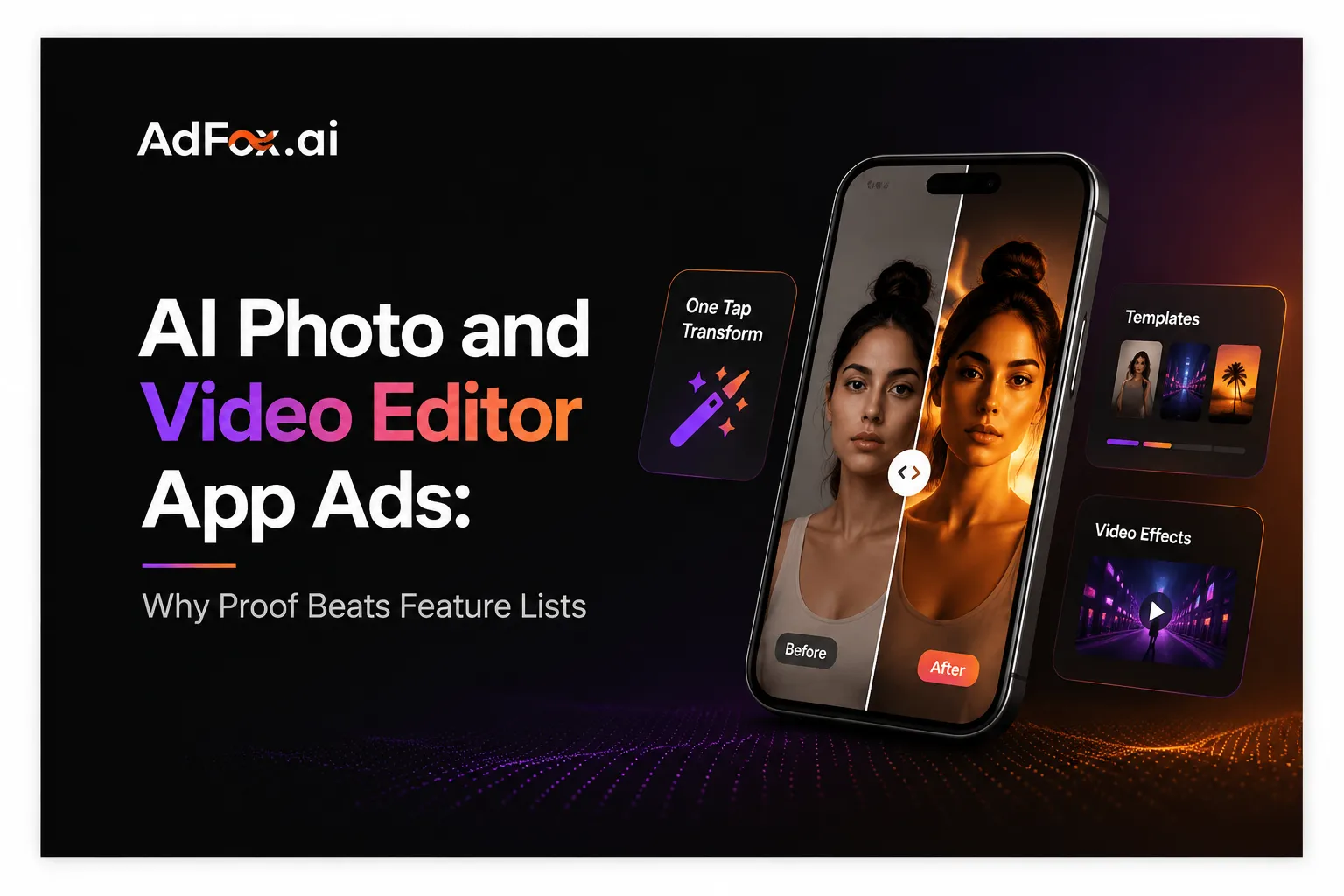
AI editing apps have a communication problem: many products promise similar capabilities, while the underlying technology is difficult to explain in a short ad. In AdFox’s a recent 30-day review of AI photo and video editor advertising, one creative response appeared repeatedly. Instead of beginning with the model, toolset, or technical process, advertisers began with visible proof.
A portrait becomes a polished campaign image. A still photo turns into a moving clip. An ordinary selfie becomes a themed character, a professional headshot, or a shareable social post. The result arrives first; the explanation follows.
This pattern matters because it turns an abstract AI claim into something a viewer can judge immediately. It also reveals a broader shift in AI app marketing: the most useful unit of communication is no longer the feature. It is the transformation.
What are the clearest creative patterns in AI editor app ads?
The clearest recurring patterns are before-and-after reveals, short tutorials, template demonstrations, creator-style walkthroughs, and emotionally framed use cases. Each format answers a different user question:
– What can this app make?
– How much effort will it take?
– Is the result relevant to me?
– Will I have something worth saving or sharing?
The ads that answer these questions in sequence tend to feel more concrete than those that simply list “AI filters,” “video generation,” or “photo enhancement.” They show the outcome, make the process look manageable, and give the viewer a reason to act.
Key findings
- Visual proof commonly appears before a detailed product explanation.
- “One photo,” “one tap,” and tutorial-style language reduces perceived effort.
- Screen recordings help turn a surprising result into a believable workflow.
- Templates make a broad AI product feel useful for a specific occasion.
- Many ads sell a social or emotional outcome, not editing technology itself.
- Repeated variants often keep the transformation while changing the opening, subject, or template.
Why does the before-and-after reveal work so well?
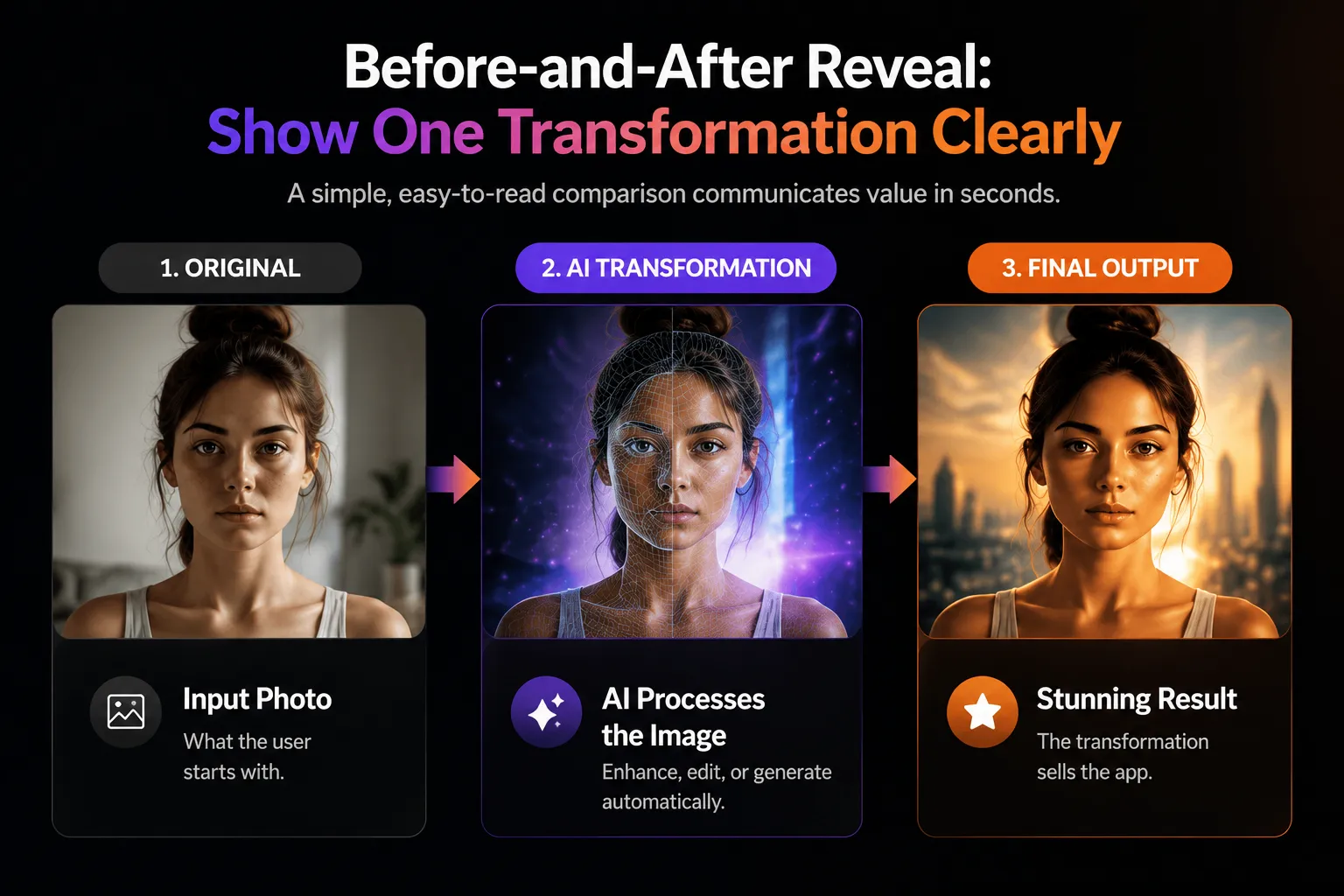
Before-and-after advertising compresses the product promise into a comparison. The viewer does not need to understand image generation, motion synthesis, background replacement, or enhancement models. The difference between the two states explains the value.
The format also creates a small information gap. When the finished image or clip looks substantially different from the input, the viewer wants to know how the change happened. That curiosity gives the ad room to introduce the app interface or a short tutorial.
The strongest versions keep the comparison easy to read. They use the same subject, similar framing, and a visible improvement or stylistic change. When too many effects appear at once, the audience may remember spectacle but not the product’s role. A clear transformation is usually more persuasive than a collage of unrelated capabilities.
This produces a practical creative rule:
Show one transformation clearly before showing many possibilities quickly.
The opening demonstrates value. Later shots can expand the range through different templates, subjects, or outputs.
How do tutorial ads make AI feel easier to use?
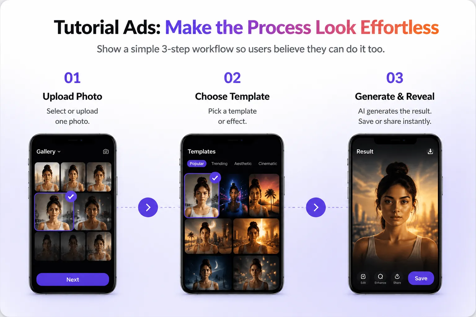
Tutorial-style ads reduce the second major barrier after credibility: effort. A viewer may like the result but assume that it requires careful prompting, manual editing, or a paid professional workflow. A short demonstration counters that assumption.
Common tutorial structures include:
- Select or upload a photo.
- Choose a template or effect.
- Wait for generation.
- Reveal, save, or share the output.
The sequence is simple, but its role is important. It gives the transformation a cause. Screen recordings, finger taps, and visible interface states make the result feel reproducible rather than magical.
Tutorial language also changes the tone of the ad. Phrases such as “here is how,” “start with one photo,” or “choose this template” position the creator as a helpful guide. The viewer receives a small lesson even before downloading. That makes the ad resemble useful social content rather than a conventional product pitch.
For creative teams, the implication is not that every ad needs a complete walkthrough. It is that one or two well-chosen interaction steps can make a bold result more credible.
Are AI editor apps selling features or social outcomes?
Increasingly, they are selling outcomes. The editing function is the mechanism, but the story is often about identity, attention, memory, or participation.
A professional portrait can support a personal brand. A themed image can become a profile picture. A motion template can help someone join a social trend. A restored or animated family photo can carry emotional meaning. A product-image generator can help a small seller create content without a studio.
These use cases translate technical capability into a recognizable job. They answer “Why would I use this today?” more effectively than a long feature menu.
This suggests a useful positioning distinction:
|
Feature-led message |
Outcome-led message |
|---|---|
|
Generate AI portraits |
Create a profile image people notice |
|
Animate a photo |
Turn a memory into a moving moment |
|
Remove backgrounds |
Make product photos ready to publish |
|
Use video templates |
Join a visual trend with your own image |
Feature language still matters, especially on the store page or product page. But the ad often performs better as an invitation into a use case. It gives the feature a destination.
Which creative formats fit this category?
Four formats are especially adaptable.
1. Transformation reveal
Open with the input and output, then explain the app. This is useful when the result is visually surprising and easy to compare.
2. Creator tutorial
Use a person, voice-over, or on-screen captions to guide the viewer through a compact workflow. This is useful when ease of use is the main objection.
3. Template carousel
Show several results built from one input. This is useful for demonstrating range, but it should retain a clear organizing idea such as professional portraits, seasonal styles, or short-video effects.
4. Emotional micro-story
Build the feature into a moment involving memory, relationships, pets, work, or self-expression. This is useful when the product benefit is more meaningful than novelty alone.
These formats can also be combined. A short story can open the ad, a result can prove the benefit, and a two-step tutorial can close the credibility gap.
What should marketers test without losing message clarity?
AI editor advertisers have many variables available, but testing everything at once makes learning difficult. A more reusable approach is to keep the core transformation stable and vary one communication layer.
AdFox calls this the Transformation Proof Stack:
1. Outcome: the final image or video worth wanting.
2. Contrast: the visible difference from the original input.
3. Mechanism: the minimum interaction needed to produce it.
4. Context: the reason the result matters to a specific user.
5. Action: the next step, such as trying a template or installing the app.
Creative teams can test different openings while preserving the same outcome. They can compare a creator introduction with an immediate reveal, or an emotional scenario with a direct tutorial. They can also keep the opening stable and vary the template, audience context, or CTA.
This approach creates related variants rather than unrelated ads. It becomes easier to see whether the hook, proof, or use case is doing the communication work.
How should the ad connect to the app-store page?
The destination should continue the promise made by the creative. If an ad promotes professional headshots, the first store screenshots should not lead with unrelated cartoon filters. If it demonstrates a specific motion template, the destination should make that capability easy to recognize.
Strong message continuity can include:
- the same visual style or transformation shown in the ad;
- a concise explanation of the required input;
- examples that clarify the range without changing the core promise;
- transparent information about access, trials, credits, or subscriptions;
- screenshots that show both results and the workflow.
AI products are especially vulnerable to expectation gaps because outputs can vary. Clear continuity does more than support conversion; it helps set an honest expectation about what the app does.
What can other app categories learn from AI editor advertising?
The broader lesson is to make invisible value visible. Utility, productivity, finance, and health apps often rely on features that are difficult to communicate in a feed. AI editing ads demonstrate how a product can convert an abstract capability into a visible state change.
The same logic can apply elsewhere:
- show the cluttered schedule before the organized one;
- show the raw document before the structured summary;
- show the scattered spending view before the categorized dashboard;
- show the manual task before the automated workflow.
The result does not need to be visually dramatic. It needs to be legible. Viewers should understand what changed, why it matters, and what role the product played.
Frequently asked questions
What is the best opening for an AI photo editor ad?
There is no universal best opening, but an immediate, easy-to-read transformation is a strong starting point. It communicates the product promise before attention drops.
Should an AI editing ad show the interface?
Usually, yes—at least briefly. Interface footage can make a surprising output feel reproducible and can reduce concern that the process is complicated.
Are feature lists useful in mobile app ads?
They are useful after the core value is clear. In short-form creative, one relevant use case is often easier to remember than a long list of tools.
How many transformations should one ad include?
Start with one clear transformation. Additional examples can demonstrate range, but they should support the same audience need or creative theme.
How can teams research competitor AI app ads?
Use AdFox to compare active creatives, recurring hooks, formats, copy, product positioning, and destination experiences across apps. Look for repeated patterns over a recent 30-day period instead of treating one eye-catching ad as a category trend.
About AdFox
AdFox is a global advertising intelligence platform that helps marketers analyze ad creatives, creative trends, competitor strategies, and advertising activity across apps, games, and websites.
Using recent advertising data, AdFox helps teams identify recurring creative patterns instead of isolated viral examples.